Written By: Nick Higginbotham; Luke Nash; and Will Demeré, Ph.D.
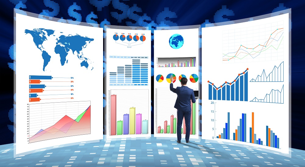
Time may seem scarcer than ever, but fortunately technological advancements have presented auditors with many tools to improve the effectiveness and efficiency of audits. One such tool is data visualization. Even with just a few hours of training, auditors can quickly gain sufficient proficiency to produce useful visualizations, expanding the capabilities of the audit team.
In each audit area discussed below, simple examples highlight how data visualizations can contribute to the effectiveness of the audit. As the starting point for each example, Tableau was used to connect to data contained in Excel spreadsheets. Visualizations can be made much more sophisticated, but the examples here provide a basic concept that can be expanded upon as necessary. An added benefit of using data visualization is the increased efficiency associated with areas such as journal entry testing and risk assessment.
While we (the authors) do not endorse any specific data visualization software, we used Tableau to create these sample data visualizations to show specific capabilities that may be useful for audit engagement teams.
RISK ASSESSMENT
A fundamental audit requirement is risk assessment, both at the beginning and throughout the execution of the audit. To ensure the effectiveness and efficiency of an audit, the engagement team needs to properly assess the risks of material misstatement and identify high-risk accounts that are more susceptible to error or manipulation. A potential indicator of heightened risk is unusual activity or unusual balances that deviate from normal or predicted levels.
As an example, a forecast is one type of visualization that is helpful for identifying such areas. Forecasting provides expectations based on historical values and other factors and reflects previous patterns in recorded amounts. Seeing the results of a forecast visually and comparing them to actual results can help auditors quickly identify unusual changes or unexpected trends, helping auditors with their understanding of the client and supporting risk assessment.
A benefit of using this data visualization is the ability to dynamically filter and sort based on underlying accounts or classes of transactions. This enables engagement teams to quickly identify unusual trends or large deviations from forecasted levels. This can be valuable in focusing auditors’ attention during risk assessment, as the visual displays are more flexible and easier to interpret than traditional tables.
In the chart “Forecasting Revenue,” we provide a simple example of a revenue forecast constructed for a sample client. This visualization shows the pattern of the client’s revenue as well as a forecast of expected revenue based on the past five years. Using data that auditors already have available, this revenue forecast accounts for the seasonality of the data and provides a confidence band for the forecasted amounts. Once this forecast is generated, it can easily be compared to financial information provided by the client to identify any obvious differences. This approach can be used for any significant account to help the auditor gain a better understanding of the client’s activity and to identify accounts that deviate substantially from expectations and thus may reflect an increased level of risk.

JOURNAL ENTRY TESTING
Another beneficial use of data visualization is for journal entry testing. Particularly for companies that frequently process a large volume of transactions and have numerous accounts, it can be difficult to identify unusual patterns or activity. Being able to identify unusual activity and higher-risk accounts quickly and easily can contribute substantially to the effectiveness and efficiency of the audit. Data visualizations enable auditors to quickly filter and compare data to identify patterns, such as which accounts were used, who created and approved journal entries, and when the entries were recorded.
For instance, data visualizations allow auditors to identify outliers that would be difficult to detect otherwise. Using relatively basic client information, the engagement team can observe distributions that might not be readily apparent using traditional financial statement support tables.
The chart “Journal Entry Testing: User” provides an example of how a visualization can make outliers obvious. This chart shows the number of transactions processed by each accounting clerk (user) by quarter. With this heat map, an auditor can quickly identify inconsistent activity at just a glance. For instance, one accounting clerk had an unusually high number of transactions processed in Q2, while a different accounting clerk had an above-average level in Q3. The activity of these two accounting clerks may require additional inquiry and could help the auditor to focus on unusual activity that could reflect errors or previously unidentified problems with controls.

Considering another characteristic of transactions, the chart “Journal Entry Testing: Average Transaction Amount” shows the average transaction amount for an account by month. Even accounting for potential seasonality, this visualization highlights the unusually high average in June, suggesting larger transactions or other unusual activity, and potentially reflecting greater risk for transactions in June. Both of these visualizations can be built quickly and allow auditors to quickly identify potential risks that may have otherwise been difficult to catch.

CUTOFF TESTING
Determining whether transactions were recorded in the correct period can be a time-consuming task that requires careful comparisons of shipping, delivery, and sales dates from underlying documents. While transactions near the end of the year still require thorough investigation, data visualization software can enable auditors to more easily identify anomalies in the overall pattern of the data and assess the corresponding risks.
The chart “Cutoff Testing” provides a visualization of the number of daily transactions for the year. As seen in this visualization, an auditor can immediately observe that there was a substantial uptick in sales at the end of December and a sharp drop at the beginning of January. While this could be due to a number of factors, an auditor looking at this visual may decide to take further action to address any concerns about inappropriate recording of sales. Seeing this data visually makes it more obvious that there may be a higher risk of sales being recorded in an incorrect period.

CLIENT COMMUNICATION
Visualizations also provide a useful means of communicating risks and findings to clients and can help clients understand what the auditor found during the engagement. Whether through a simple chart or a complete dashboard, clients can use this information to improve their risk environment, tighten controls, and better comprehend the auditor’s suggestions.
The reverse can be true as well, as some clients develop dashboards that highlight key metrics using indicators for changes year-over-year. This helps get important client data into the hands of auditors in a way that is easily interpretable and ready to analyze. By leveraging client dashboards, auditors can establish a better understanding during the planning stage and identify high-risk areas to focus on throughout the audit.
With good communication and the sharing of data, auditors can help companies to better identify problems in the financial reporting process before the end of the year and can help companies stay aware of accounting and control issues that arise throughout the year. Data visualizations can help to facilitate such communication and improve the ease with which findings are shared.
IMPROVING EFFECTIVENESS, EFFICIENCY
As shown in the examples, data visualization software provides many capabilities that can contribute to effectiveness and efficiency in many areas of the audit. Data visualizations offer a valuable complement to Excel and other auditing applications that may assist auditors with risk assessment, substantive testing, and client communication.
In most cases, auditors can use data already provided by clients to generate visualizations. The process of connecting to such data using a data visualization program is quick and straightforward, so updating the visualizations every quarter or year is relatively simple.
While data visualization software is not a silver bullet, audit firms are taking notice of the potential advantages and using data visualization to add value to the auditing process. The prevalence of data visualization software continues to increase, and its use can help auditors leverage client data to improve the effectiveness and efficiency of the audit process.
About the authors
Nick Higginbotham
To comment on this article or to suggest an idea for another article, contact Ken Tysiac, the JofA’s editorial director, at Kenneth.Tysiac@aicpa-cima.com.

No responses yet